Rethinking the Pickx Login Flow
Marwan Louhichi
Sometimes, the smallest friction creates the biggest drop-off.
As the UX designer responsible for the Pickx mobile platform at Proximus, I noticed something that others had overlooked for too long: our login experience was broken. While not officially prioritized, I knew that this “entry door” was affecting adoption, satisfaction, and ultimately, brand perception. So I took the lead.
From Assumption to Action
This led to several quick wins: improved copywriting & wording , Inclusion of terms and conditions and
General accessibility fixes across platforms.
User Research to Confirm Reality
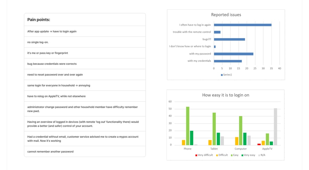
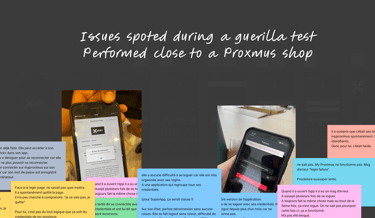
We then moved to guerrilla user testing with Marketing and UX peers. The outcome was clear:
📉 Key Pain Points
Login failures despite correct credentials
Recurrent disconnections (especially after updates)
MyProximus ID mismatch or forgotten passwords
FaceID improved experience, but not for all users
Legacy accounts required full account recreation
📈 These findings validated the need for both UI and technical improvements.
Two Problems, Two Paths
Each solution came with pros/cons in terms of security, UX simplicity, ecosystem compatibility, and technical feasibility
Technical Issues (Escalated to Product Ownership)
Repeated login prompts
Buggy session resets after updates
Shared household credentials causing confusion
POs took these issues seriously and integrated them into their backlog for resolution.
Business Considerations
We didn’t stop at design. I initiated a quantitative survey to prioritize what mattered most to our users:
Only 21% had content discovery issues… but login issues were affecting ~40% of users
Less than 20% found logging in “very easy”
Users valued speed, biometric login, and cross-platform fluidity
Those using password managers (Samsung Pass, Apple Keychain) had a far smoother experience
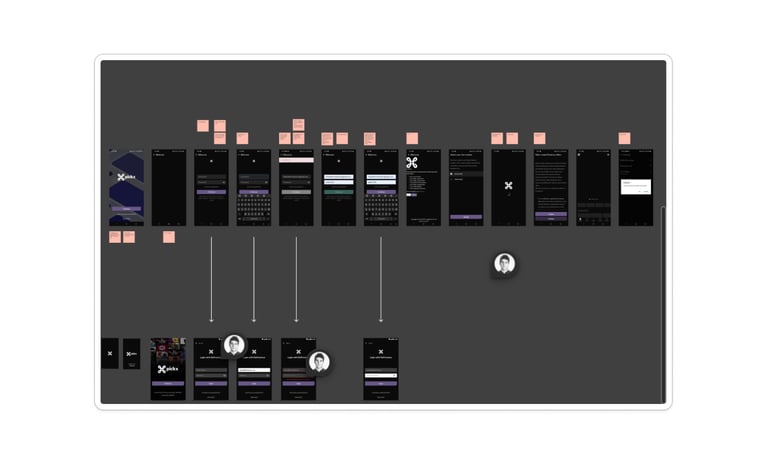
Step 1 — Making the Case
I voiced my concerns to product owners and managers, showing how login friction undermined Pickx adoption goals. Marketing, at the same time, was eager to boost app usage this created a strategic alignment.
Step 2 — Accessibility & UX Audit
We kicked off a full audit across:
iOS and Android
Apple TV (tvOS)
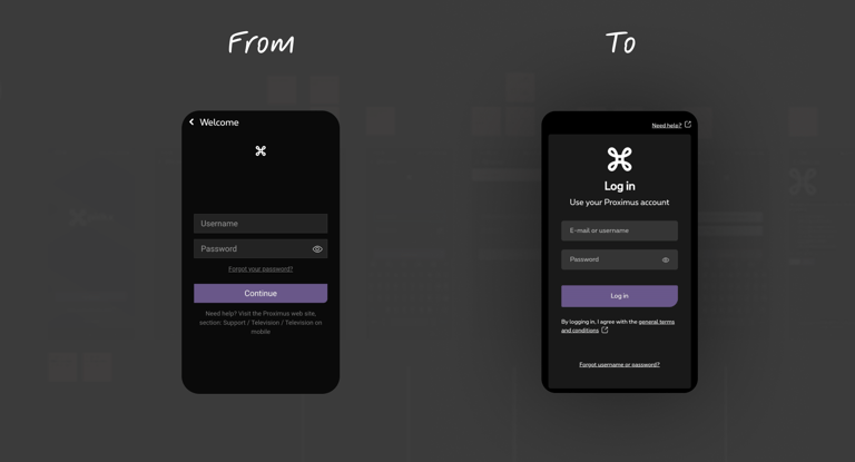
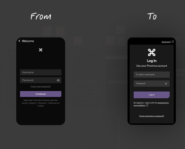
UX/UI Improvements (Owned by Design)
Improved page hierarchy and copy
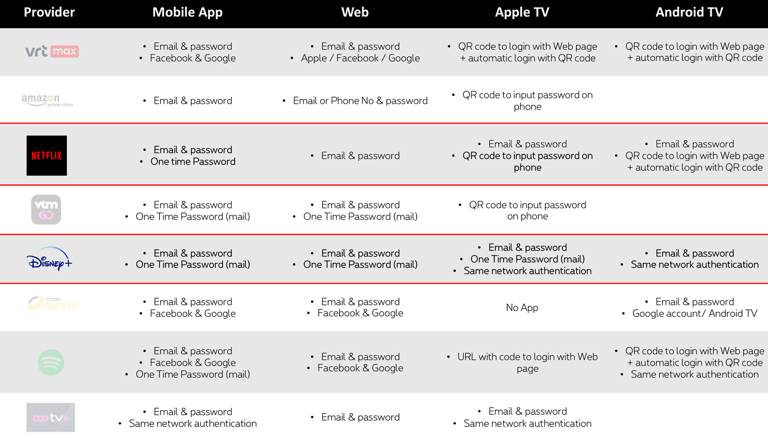
Benchmarked flows from major streaming platforms
Introduced three enhancement proposals:
One-Time Password (OTP) login
Device password manager & biometric triggers
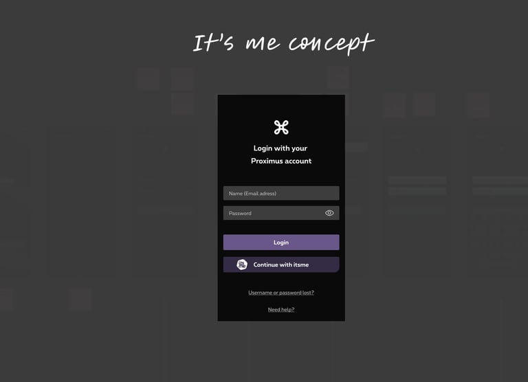
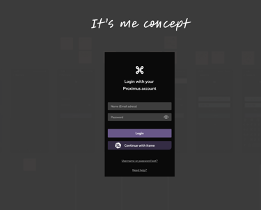
SSO via It's Me (already used in other Proximus apps)

Outcome & Roadmap
UX/UI fixes (copy, accessibility) rolled out
These changes improved first-time user understanding and inclusivity without requiring heavy development effort.
We rolled out several immediate design improvements across both iOS and Android:
Revised page titles and labels to clarify the login intent and reduce cognitive load.
Integrated general terms & conditions directly within the flow (instead of in a separate screen), reducing steps and improving compliance perception.
Enhanced color contrast, font sizes, and focus states for better accessibility, based on WCAG guidelines and device-specific testing (including Apple TV).
These changes improved first-time user understanding and inclusivity without requiring heavy development effort.
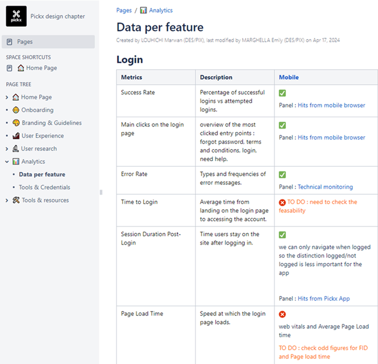
Login Dashboard for Analytics
A key contribution was defining the right KPIs to track login friction, and pushing for a live dashboard implementation by the Analytics PO. The metrics included:
📉 Login Failure Rate: % of failed attempts due to invalid credentials, system errors, or UI confusion
🔁 Re-authentication Frequency: how often users are forced to log in again (post-update, timeout, bug)
⏱️ Session Timeout Analysis: tracking durations of valid sessions before automatic disconnection
This gave the team a shared, data-driven foundation to continuously improve the login experience.
OTP, SSO & Biometric Flows Scoped into Long-Term Roadmap
Based on benchmarks and user feedback, I proposed an incremental roadmap for login innovation:
OTP (One-Time Password): ideal for new users or forgotten passwords; low-friction but needed workaround due to platform constraints (user has to leave the app).
Device Password Managers: enhancement of native biometric authentication (Samsung Pass, Apple Keychain), especially for returning users.
SSO via It’s Me: promising for secure, instant onboarding aligned with other Proximus apps, but required a tech feasibility study and budget evaluation.
What I learned ?
Even when you're not officially “assigned,” your instincts as a UX designer matter.
The best way to influence product strategy is to bring evidence, not just ideas.
A good login experience is invisible until it fails. Fixing it is a brand act.